
NINA HAGLUND
About
Resume
Contact
Rebranding Rentgrata for its next chapter
Role
Lead Product Designer
Skills
Brand, Identity, Web, Webflow
Timeline
Nov 2024
OVERVIEW
Rentgrata had earned a strong reputation in multifamily. The brand hadn't kept up.
Rentgrata connects prospective renters with current residents, helping property management companies lease apartments faster through peer-to-peer conversations. By 2024 the product was strong, the client base was growing, and the company was in acquisition conversations. The brand looked like it hadn't been touched in years. This is the story of the workshop-driven process that changed that, and what happened when the new brand shipped.
WHAT IT WAS
A full rebrand and website redesign for Rentgrata, from brand strategy workshops through Webflow build and launch.
MY ROLE
Sole designer end to end. Designed and facilitated the brand workshop, developed the identity system, led the site UX, and built it in Webflow.
The Interesting Part
Before touching a single design frame, I ran two days of workshops with the founders and leadership team. The visual work came after the whole company agreed on who Rentgrata was.
What Shipped
A WCAG AAA-compliant brand identity and a redesigned website that introduced Rentgrata's new AI product, RGenie, to the market for the first time.
What Came Next
Website traffic increased 92% in the first two months post-launch. Rentgrata was acquired by Opiniion in July 2025.
THE PROBLEM
Three problems arriving at the same time.
Rentgrata was preparing for a significant moment. The company was in acquisition conversations, actively positioning itself as a leader in the multifamily space, and about to introduce a new AI product to the market. The existing brand couldn't support any of those three things.
The visual identity failed WCAG AAA accessibility standards. The website had no mention of RGenie, the new AI product. And the overall brand presence didn't reflect the company Rentgrata had become. In acquisition conversations, the first thing a potential partner sees is the website. What they were seeing wasn't telling the right story.
A rebrand at this moment wasn't a cosmetic exercise. It was a strategic one. The brand needed to earn the room before anyone opened a pitch deck.
0
Pages featuring the new AI product before the redesign

AAA
WCAG compliance level the existing brand failed to meet
10+
Pages designed and built in Webflow for launch
Discovery
The Workshop: Two days of structured work before a single design frame.
The temptation on a rebrand is to start with logos and color palettes. The risk with that approach is making something beautiful that leadership doesn't believe in, or that doesn't reflect who the company actually is. Before any design work began, I designed and facilitated a two-day brand workshop with Rentgrata's founders and leadership team.
The goal wasn't just to gather input. It was to raise the team's collective design literacy and give everyone the vocabulary to make good decisions together. I built eight FigJam modules covering brand education, a brand audit, competitive positioning, the Golden Circle "Find Our Why" exercise, brand archetypes, personality adjectives, target audience mapping, and voice and tone.
Workshop
The two-day agenda. Day one covered brand education, the existing brand audit, and the Golden Circle exercise. Day two went deeper on competitive positioning, archetypes, and voice and tone. I designed every module from scratch.
Finding the Why before finding the look.
Using Simon Sinek's Golden Circle framework, I guided the team through defining Rentgrata's What, How, and Why. The exercise sounds simple. Getting a room full of founders to agree on a single sentence for each is not. The team landed on something clear and specific: Rentgrata increases leasing performance by connecting people, so we can make renting better. That three-part statement became the foundation for every brand decision that followed.
Exercise: Find our why
The Golden Circle exercise in FigJam. Sticky notes from the full team were synthesized into the three-part statement at the bottom: the foundation for all brand and messaging decisions.
Exercise: Brand Archetypes
We landed on Sage as the primary archetype (knowledgeable, data-forward, trustworthy) and Everyman with a touch of Caregiver as secondary. This directly shaped everything from visual direction to copywriting tone.
Giving our brand a personality.
Two exercises defined the brand's character before anyone opened Figma. The personality adjectives exercise had the team vote on descriptors from a full grid. The top four that emerged: Authentic, Human, Innovative, Knowledgeable. Those four words became a filter for every design decision in the months that followed.
The voice and tone exercise worked through Aaker's five brand personality dimensions, using binary choices to converge on a clear voice: sincere, contemporary, reliable, and frank. Friendly but not casual. Sophisticated but accessible. Confident but not exclusive.
Exercise: Personality adjectives
Top four characteristics: Authentic, Human, Innovative, Knowledgeable. These became the filter for design decisions throughout the project.
Exercise: Voice and tone discovery
Binary choices across five Aaker dimensions converged on a clear voice: sincere, contemporary, reliable, and frank.
TRADEOFFS
The decisions that shaped what shipped.
A rebrand at a company with two distinct customer types (property managers and renters) is a positioning problem as much as a visual one. Every major decision had a real tradeoff.
What We chose
One brand system for both audiences, differentiated through content strategy rather than separate visual identities
Sage plus Everyman archetypes to balance credibility with warmth
WCAG AAA as a Day 1 design constraint, not a post-launch checklist
Webflow for the build, so marketing could own updates without a designer in the loop
Ari as a product within the Rentgrata brand, not a separate identity
What We Left Behind
Separate identities for property managers vs. renters. Too costly to maintain and dilutes brand recognition.
Leaning harder into enterprise visual language, which would have sacrificed the human and community differentiator
Treating accessibility as a retrofit. Retrofitting color systems after the fact is more expensive and less reliable.
A custom-coded site that would require ongoing dev resources the team didn't have
A standalone Ari brand. Too early to fragment the story, especially during acquisition conversations.
The hardest tradeoff: The brand had to feel credible to executives in a board meeting and human to someone deciding where to live. The archetype framework gave us a shared vocabulary for navigating that tension without arbitrarily splitting the difference.
What Changed
Where leadership shaped the work, and where I held the line.
Where leadership was right
The founders pushed back on early concepts they felt were too corporate. That was useful feedback. It pushed me to re-examine where I had overweighted the Sage archetype and underplayed the Everyman. The final color palette and photography direction shifted meaningfully as a result, and it was the right call.
They also pushed for a narrative-led homepage structure that opened with the company's why and let features come later. The original wireframe had led with product functionality. Their instinct was better, and the research from the workshop supported it.
Where I held the line
There was pressure at one point to give Ari a completely separate visual identity, with its own colors, logo system, and brand voice. I held on this, supported by the competitive analysis from the workshop showing that fragmented sub-brands at this company size typically create confusion in exactly the enterprise sales contexts Rentgrata was targeting.
I also pushed back on skipping the wireframing phase to go straight to high-fidelity. Late-stage layout changes in a built Webflow site are expensive. The wireframe phase caught three significant content structure issues before they became visual design problems.
Homepage Wireframe
Hi-fi wireframe for the homepage. Layout, copy structure, and component hierarchy locked before visual design began.
How It Works wireframe
How It Works page wireframe. The interactive walkthrough structure designed to communicate the product's unique flow before styling was applied.
What Shipped
A brand system built to earn the room.
The new brand applied across a full redesigned website, launched in November 2024, ten months from the first workshop session to production. Warm but polished. Data-forward but human. Designed to speak to property managers and renters without feeling split.
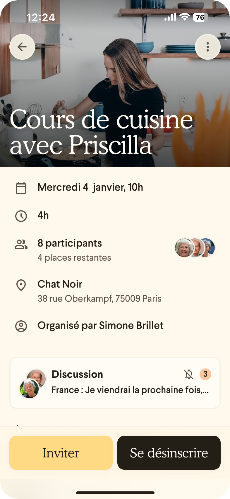
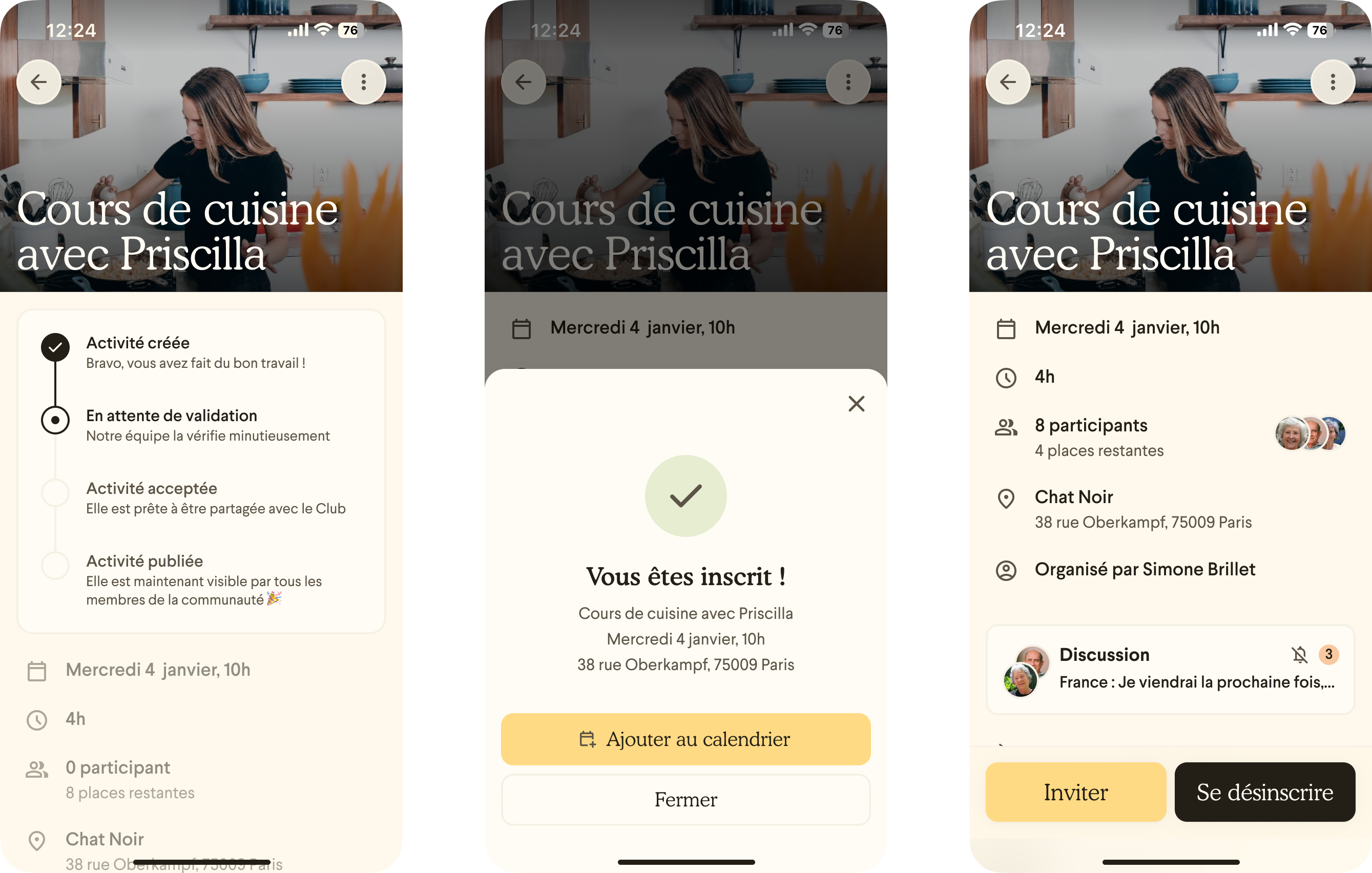
Homepage. The hero communicates the core value prop with immediacy. Trusted-by logos and metrics establish credibility above the fold.
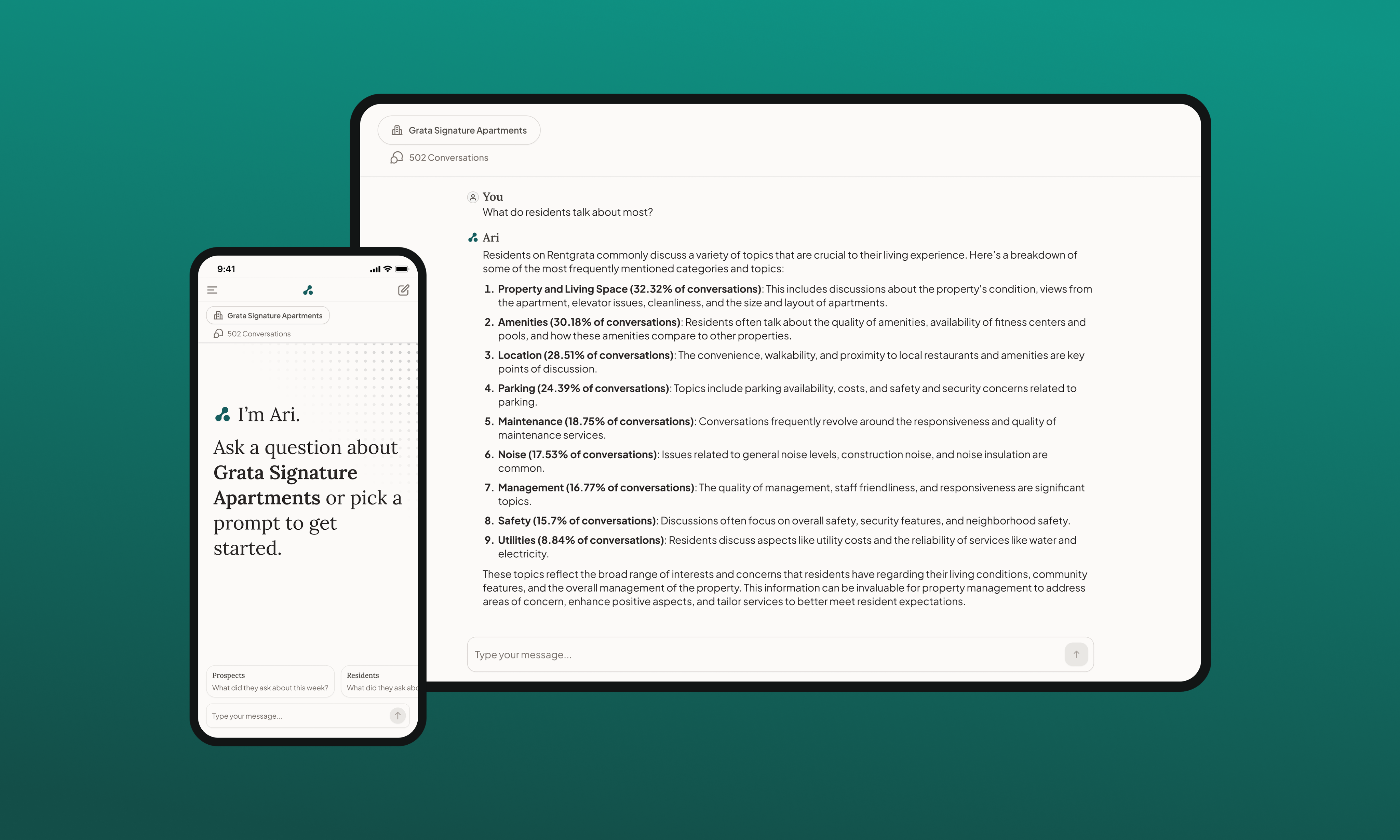
Solutions
Solutions page, featuring Ari publicly for the first time. Benefit-led messaging designed for property managers' goals.
+92%
Website traffic In the first two months post-launch
AAA
WCAG compliant accessibility standards
Acquired
The AI product had no public presence before this launch. The new site gave it a home and a story.
What I Learned
What this project taught me about alignment as a design tool.
On Process
Workshop before design is not extra work. It is the work.
Investing two days in alignment before opening Figma meant every design decision afterward had a shared foundation. Nobody was surprised by the direction. Everyone had participated in building it.
On Education
Teaching stakeholders raises the quality of their feedback.
Opening the workshop with brand education, covering archetypes, naming, and design maturity, gave leadership the vocabulary to give useful input rather than reactive opinions. That investment paid back across every review session.
On Constraints
Accessibility as a Day 1 constraint makes better design.
Designing to WCAG AAA from the start pushed the color palette toward choices that were more considered and more distinctive than what an unconstrained palette would have produced. Constraints are often a gift.
On Pushback
Design judgment earns credibility when it is backed by shared goals.
When I pushed back on fragmenting the Ari brand, the argument wasn't aesthetic. It was strategic: fragmentation would hurt the acquisition conversations we were actively having. That framing landed in a way that "I think it looks wrong" never would have.

Let’s chat

© 2026 Nina Haglund
NINA HAGLUND
About
Resume
Contact
Rebranding Rentgrata for its next chapter
Role
Lead Product Designer
Skills
Brand, Identity, Web, Webflow
Timeline
Nov 2024
OVERVIEW
Rentgrata had earned a strong reputation in multifamily. The brand hadn't kept up.
Rentgrata connects prospective renters with current residents, helping property management companies lease apartments faster through peer-to-peer conversations. By 2024 the product was strong, the client base was growing, and the company was in acquisition conversations. The brand looked like it hadn't been touched in years. This is the story of the workshop-driven process that changed that, and what happened when the new brand shipped.
WHAT IT WAS
A full rebrand and website redesign for Rentgrata, from brand strategy workshops through Webflow build and launch.
MY ROLE
Sole designer end to end. Designed and facilitated the brand workshop, developed the identity system, led the site UX, and built it in Webflow.
The Interesting Part
Before touching a single design frame, I ran two days of workshops with the founders and leadership team. The visual work came after the whole company agreed on who Rentgrata was.
What Shipped
A WCAG AAA-compliant brand identity and a redesigned website that introduced Rentgrata's new AI product, RGenie, to the market for the first time.
What Came Next
Website traffic increased 92% in the first two months post-launch. Rentgrata was acquired by Opiniion in July 2025.
THE PROBLEM
Three problems arriving at the same time.
Rentgrata was preparing for a significant moment. The company was in acquisition conversations, actively positioning itself as a leader in the multifamily space, and about to introduce a new AI product to the market. The existing brand couldn't support any of those three things.
The visual identity failed WCAG AAA accessibility standards. The website had no mention of RGenie, the new AI product. And the overall brand presence didn't reflect the company Rentgrata had become. In acquisition conversations, the first thing a potential partner sees is the website. What they were seeing wasn't telling the right story.
A rebrand at this moment wasn't a cosmetic exercise. It was a strategic one. The brand needed to earn the room before anyone opened a pitch deck.
0
Pages featuring the new AI product before the redesign

AAA
WCAG compliance level the existing brand failed to meet
10+
Pages designed and built in Webflow for launch
Discovery
The Workshop: Two days of structured work before a single design frame.
The temptation on a rebrand is to start with logos and color palettes. The risk with that approach is making something beautiful that leadership doesn't believe in, or that doesn't reflect who the company actually is. Before any design work began, I designed and facilitated a two-day brand workshop with Rentgrata's founders and leadership team.
The goal wasn't just to gather input. It was to raise the team's collective design literacy and give everyone the vocabulary to make good decisions together. I built eight FigJam modules covering brand education, a brand audit, competitive positioning, the Golden Circle "Find Our Why" exercise, brand archetypes, personality adjectives, target audience mapping, and voice and tone.
Workshop
The two-day agenda. Day one covered brand education, the existing brand audit, and the Golden Circle exercise. Day two went deeper on competitive positioning, archetypes, and voice and tone. I designed every module from scratch.
Finding the Why before finding the look.
Using Simon Sinek's Golden Circle framework, I guided the team through defining Rentgrata's What, How, and Why. The exercise sounds simple. Getting a room full of founders to agree on a single sentence for each is not. The team landed on something clear and specific: Rentgrata increases leasing performance by connecting people, so we can make renting better. That three-part statement became the foundation for every brand decision that followed.
Exercise: Find our why
The Golden Circle exercise in FigJam. Sticky notes from the full team were synthesized into the three-part statement at the bottom: the foundation for all brand and messaging decisions.
Exercise: Brand Archetypes
We landed on Sage as the primary archetype (knowledgeable, data-forward, trustworthy) and Everyman with a touch of Caregiver as secondary. This directly shaped everything from visual direction to copywriting tone.
Giving our brand a personality.
Two exercises defined the brand's character before anyone opened Figma. The personality adjectives exercise had the team vote on descriptors from a full grid. The top four that emerged: Authentic, Human, Innovative, Knowledgeable. Those four words became a filter for every design decision in the months that followed.
The voice and tone exercise worked through Aaker's five brand personality dimensions, using binary choices to converge on a clear voice: sincere, contemporary, reliable, and frank. Friendly but not casual. Sophisticated but accessible. Confident but not exclusive.
Exercise: Personality adjectives
Top four characteristics: Authentic, Human, Innovative, Knowledgeable. These became the filter for design decisions throughout the project.
Exercise: Voice and tone discovery
Binary choices across five Aaker dimensions converged on a clear voice: sincere, contemporary, reliable, and frank.
TRADEOFFS
The decisions that shaped what shipped.
A rebrand at a company with two distinct customer types (property managers and renters) is a positioning problem as much as a visual one. Every major decision had a real tradeoff.
What We chose
One brand system for both audiences, differentiated through content strategy rather than separate visual identities
Sage plus Everyman archetypes to balance credibility with warmth
WCAG AAA as a Day 1 design constraint, not a post-launch checklist
Webflow for the build, so marketing could own updates without a designer in the loop
Ari as a product within the Rentgrata brand, not a separate identity
What We Left Behind
Separate identities for property managers vs. renters. Too costly to maintain and dilutes brand recognition.
Leaning harder into enterprise visual language, which would have sacrificed the human and community differentiator
Treating accessibility as a retrofit. Retrofitting color systems after the fact is more expensive and less reliable.
A custom-coded site that would require ongoing dev resources the team didn't have
A standalone Ari brand. Too early to fragment the story, especially during acquisition conversations.
The hardest tradeoff: The brand had to feel credible to executives in a board meeting and human to someone deciding where to live. The archetype framework gave us a shared vocabulary for navigating that tension without arbitrarily splitting the difference.
What Changed
Where leadership shaped the work, and where I held the line.
Where leadership was right
The founders pushed back on early concepts they felt were too corporate. That was useful feedback. It pushed me to re-examine where I had overweighted the Sage archetype and underplayed the Everyman. The final color palette and photography direction shifted meaningfully as a result, and it was the right call.
They also pushed for a narrative-led homepage structure that opened with the company's why and let features come later. The original wireframe had led with product functionality. Their instinct was better, and the research from the workshop supported it.
Where I held the line
There was pressure at one point to give Ari a completely separate visual identity, with its own colors, logo system, and brand voice. I held on this, supported by the competitive analysis from the workshop showing that fragmented sub-brands at this company size typically create confusion in exactly the enterprise sales contexts Rentgrata was targeting.
I also pushed back on skipping the wireframing phase to go straight to high-fidelity. Late-stage layout changes in a built Webflow site are expensive. The wireframe phase caught three significant content structure issues before they became visual design problems.
Homepage Wireframe
Hi-fi wireframe for the homepage. Layout, copy structure, and component hierarchy locked before visual design began.
How It Works wireframe
How It Works page wireframe. The interactive walkthrough structure designed to communicate the product's unique flow before styling was applied.
What Shipped
A brand system built to earn the room.
The new brand applied across a full redesigned website, launched in November 2024, ten months from the first workshop session to production. Warm but polished. Data-forward but human. Designed to speak to property managers and renters without feeling split.
Homepage. The hero communicates the core value prop with immediacy. Trusted-by logos and metrics establish credibility above the fold.
Solutions
Solutions page, featuring Ari publicly for the first time. Benefit-led messaging designed for property managers' goals.
+92%
Website traffic In the first two months post-launch
AAA
WCAG compliant accessibility standards
Acquired
The AI product had no public presence before this launch. The new site gave it a home and a story.
What I Learned
What this project taught me about alignment as a design tool.
On Process
Workshop before design is not extra work. It is the work.
Investing two days in alignment before opening Figma meant every design decision afterward had a shared foundation. Nobody was surprised by the direction. Everyone had participated in building it.
On Education
Teaching stakeholders raises the quality of their feedback.
Opening the workshop with brand education, covering archetypes, naming, and design maturity, gave leadership the vocabulary to give useful input rather than reactive opinions. That investment paid back across every review session.
On Constraints
Accessibility as a Day 1 constraint makes better design.
Designing to WCAG AAA from the start pushed the color palette toward choices that were more considered and more distinctive than what an unconstrained palette would have produced. Constraints are often a gift.
On Pushback
Design judgment earns credibility when it is backed by shared goals.
When I pushed back on fragmenting the Ari brand, the argument wasn't aesthetic. It was strategic: fragmentation would hurt the acquisition conversations we were actively having. That framing landed in a way that "I think it looks wrong" never would have.
Let’s chat
© 2026 Nina Haglund
NINA HAGLUND
About
Resume
Contact
Rebranding Rentgrata for its next chapter
Role
Lead Product Designer
Skills
Brand, Identity, Web, Webflow
Shipped
Nov 2024
OVERVIEW
Rentgrata had earned a strong reputation in multifamily. The brand hadn't kept up.
Rentgrata connects prospective renters with current residents, helping property management companies lease apartments faster through peer-to-peer conversations. By 2024 the product was strong, the client base was growing, and the company was in acquisition conversations. The brand looked like it hadn't been touched in years. This is the story of the workshop-driven process that changed that, and what happened when the new brand shipped.
WHAT IT WAS
A full rebrand and website redesign for Rentgrata, from brand strategy workshops through Webflow build and launch.
MY ROLE
Sole designer end to end. Designed and facilitated the brand workshop, developed the identity system, led the site UX, and built it in Webflow.
The Interesting Part
Before touching a single design frame, I ran two days of workshops with the founders and leadership team. The visual work came after the whole company agreed on who Rentgrata was.
What Shipped
A WCAG AAA-compliant brand identity and a redesigned website that introduced Rentgrata's new AI product, RGenie, to the market for the first time.
What Came Next
Website traffic increased 92% in the first two months post-launch. Rentgrata was acquired by Opiniion in July 2025.
THE PROBLEM
Three problems arriving at the same time.
Rentgrata was preparing for a significant moment. The company was in acquisition conversations, actively positioning itself as a leader in the multifamily space, and about to introduce a new AI product to the market. The existing brand couldn't support any of those three things.
The visual identity failed WCAG AAA accessibility standards. The website had no mention of RGenie, the new AI product. And the overall brand presence didn't reflect the company Rentgrata had become. In acquisition conversations, the first thing a potential partner sees is the website. What they were seeing wasn't telling the right story.
A rebrand at this moment wasn't a cosmetic exercise. It was a strategic one. The brand needed to earn the room before anyone opened a pitch deck.
0
Pages featuring the new AI product before the redesign
AAA
WCAG compliance level the existing brand failed to meet
10+
Pages designed and built in Webflow for launch
Discovery
The Workshop: Two days of structured work before a single design frame.
The temptation on a rebrand is to start with logos and color palettes. The risk with that approach is making something beautiful that leadership doesn't believe in, or that doesn't reflect who the company actually is. Before any design work began, I designed and facilitated a two-day brand workshop with Rentgrata's founders and leadership team.
The goal wasn't just to gather input. It was to raise the team's collective design literacy and give everyone the vocabulary to make good decisions together. I built eight FigJam modules covering brand education, a brand audit, competitive positioning, the Golden Circle "Find Our Why" exercise, brand archetypes, personality adjectives, target audience mapping, and voice and tone.
Workshop
The two-day agenda. Day one covered brand education, the existing brand audit, and the Golden Circle exercise. Day two went deeper on competitive positioning, archetypes, and voice and tone. I designed every module from scratch.
Finding the Why before finding the look.
Using Simon Sinek's Golden Circle framework, I guided the team through defining Rentgrata's What, How, and Why. The exercise sounds simple. Getting a room full of founders to agree on a single sentence for each is not. The team landed on something clear and specific: Rentgrata increases leasing performance by connecting people, so we can make renting better. That three-part statement became the foundation for every brand decision that followed.
Exercise: Find our why
The Golden Circle exercise in FigJam. Sticky notes from the full team were synthesized into the three-part statement at the bottom: the foundation for all brand and messaging decisions.
Exercise: Brand Archetypes
We landed on Sage as the primary archetype (knowledgeable, data-forward, trustworthy) and Everyman with a touch of Caregiver as secondary. This directly shaped everything from visual direction to copywriting tone.
Giving our brand a personality.
Two exercises defined the brand's character before anyone opened Figma. The personality adjectives exercise had the team vote on descriptors from a full grid. The top four that emerged: Authentic, Human, Innovative, Knowledgeable. Those four words became a filter for every design decision in the months that followed.
The voice and tone exercise worked through Aaker's five brand personality dimensions, using binary choices to converge on a clear voice: sincere, contemporary, reliable, and frank. Friendly but not casual. Sophisticated but accessible. Confident but not exclusive.
Exercise: Personality adjectives
Top four characteristics: Authentic, Human, Innovative, Knowledgeable. These became the filter for design decisions throughout the project.
Exercise: Voice and tone discovery
Binary choices across five Aaker dimensions converged on a clear voice: sincere, contemporary, reliable, and frank.
TRADEOFFS
The decisions that shaped what shipped.
A rebrand at a company with two distinct customer types (property managers and renters) is a positioning problem as much as a visual one. Every major decision had a real tradeoff.
What We chose
One brand system for both audiences, differentiated through content strategy rather than separate visual identities
Sage plus Everyman archetypes to balance credibility with warmth
WCAG AAA as a Day 1 design constraint, not a post-launch checklist
Webflow for the build, so marketing could own updates without a designer in the loop
Ari as a product within the Rentgrata brand, not a separate identity
What We Left Behind
Separate identities for property managers vs. renters. Too costly to maintain and dilutes brand recognition.
Leaning harder into enterprise visual language, which would have sacrificed the human and community differentiator
Treating accessibility as a retrofit. Retrofitting color systems after the fact is more expensive and less reliable.
A custom-coded site that would require ongoing dev resources the team didn't have
A standalone Ari brand. Too early to fragment the story, especially during acquisition conversations.
The hardest tradeoff: The brand had to feel credible to executives in a board meeting and human to someone deciding where to live. The archetype framework gave us a shared vocabulary for navigating that tension without arbitrarily splitting the difference.
What Changed
Where leadership shaped the work, and where I held the line.
Where leadership was right
The founders pushed back on early concepts they felt were too corporate. That was useful feedback. It pushed me to re-examine where I had overweighted the Sage archetype and underplayed the Everyman. The final color palette and photography direction shifted meaningfully as a result, and it was the right call.
They also pushed for a narrative-led homepage structure that opened with the company's why and let features come later. The original wireframe had led with product functionality. Their instinct was better, and the research from the workshop supported it.
Where I held the line
There was pressure at one point to give Ari a completely separate visual identity, with its own colors, logo system, and brand voice. I held on this, supported by the competitive analysis from the workshop showing that fragmented sub-brands at this company size typically create confusion in exactly the enterprise sales contexts Rentgrata was targeting.
I also pushed back on skipping the wireframing phase to go straight to high-fidelity. Late-stage layout changes in a built Webflow site are expensive. The wireframe phase caught three significant content structure issues before they became visual design problems.
Homepage Wireframe
Hi-fi wireframe for the homepage. Layout, copy structure, and component hierarchy locked before visual design began.
How It Works wireframe
How It Works page wireframe. The interactive walkthrough structure designed to communicate the product's unique flow before styling was applied.
What Shipped
A brand system built to earn the room.
The new brand applied across a full redesigned website, launched in November 2024, ten months from the first workshop session to production. Warm but polished. Data-forward but human. Designed to speak to property managers and renters without feeling split.
Homepage. The hero communicates the core value prop with immediacy. Trusted-by logos and metrics establish credibility above the fold.
Solutions
Solutions page, featuring Ari publicly for the first time. Benefit-led messaging designed for property managers' goals.
+92%
Website traffic In the first two months post-launch
AAA
WCAG compliant accessibility standards
Acquired
The rebrand was part of the strategic positioning push that supported the acquisition.
What I Learned
What this project taught me about alignment as a design tool.
On Process
Workshop before design is not extra work. It is the work.
Investing two days in alignment before opening Figma meant every design decision afterward had a shared foundation. Nobody was surprised by the direction. Everyone had participated in building it.
On Education
Teaching stakeholders raises the quality of their feedback.
Opening the workshop with brand education, covering archetypes, naming, and design maturity, gave leadership the vocabulary to give useful input rather than reactive opinions. That investment paid back across every review session.
On Constraints
Accessibility as a Day 1 constraint makes better design.
Designing to WCAG AAA from the start pushed the color palette toward choices that were more considered and more distinctive than what an unconstrained palette would have produced. Constraints are often a gift.
On Pushback
Design judgment earns credibility when it is backed by shared goals.
When I pushed back on fragmenting the Ari brand, the argument wasn't aesthetic. It was strategic: fragmentation would hurt the acquisition conversations we were actively having. That framing landed in a way that "I think it looks wrong" never would have.
Let’s chat
© 2026 Nina Haglund