
NINA HAGLUND
About
Resume
Contact
Redesigning the Rentgrata Messenger around a new multi-resident routing system
Role
Lead Product Designer
Skills
Product Design, User Research, Testing
Shipped
April 2026
OVERVIEW
Rentgrata's core value is a real conversation with a real person. The UX wasn't living up to that promise.
Rentgrata helps prospective renters make better decisions by connecting them with verified current residents for authentic peer-to-peer conversations. The messenger widget that powered those conversations was outdated, confusing, and not converting. This project was a ground-up redesign, informed by 44 usability tests across three design variants, with the goal of making the product work as well as its premise.
WHAT IT WAS
A full redesign of the Rentgrata resident messenger, including the embeddable website widget, the standalone browser landing page, and the Neighbor Nurture email flow.
MY ROLE
Led research design, usability testing, synthesis, and all product design. Collaborated closely with product and engineering throughout.
The Approach
Three design variants tested with 44 users across multiple market segments before a single direction was finalized. Research drove the design, not the other way around.
The Strategic Change
Introduced a waterfall notification system that alerts multiple residents when a prospect sends a message, increasing the likelihood of a fast response.
Status
Shipped on multiple client websites in April 2026. Results are being tracked as the product ramps up across client communities.
THE PROBLEM
Three entry points. All of them needed work.
The Rentgrata messenger reached prospects through three entry points: a compact widget that lives on property management websites, a standalone browser landing page linked directly to a specific community, and a Neighbor Nurture email flow that proactively reaches prospects who have already shown interest. Each had its own design debt, but they shared the same underlying problems.
Getting to a testable direction required significant internal alignment first. Leadership, product, and design worked through many rounds of wireframes and structural explorations before the team agreed on what the redesign should actually solve for. That process was slow, but it was also valuable. By the time we reached high-fidelity designs, the entire team had a shared understanding of the problem and clear criteria for what success looked like. The 44-user usability study ran on those high-fidelity prototypes, which meant feedback was concrete and actionable rather than abstract.
The product's differentiator was authenticity, real residents, real answers. But the UX was eroding that trust before a prospect ever sent a message.
The existing designs were visually outdated and hadn't been revisited with fresh user research. The compact widget looked like a generic chat button, giving no signal that real people were on the other end. The "first available resident" routing logic confused users who expected to choose who they talked to. The move-in bonus, a genuine incentive, was being misread as a red flag. And nobody knew what happened after they hit send.
Underneath all of this was a more structural problem: resident response rates. When a prospect sent a message, it went to a single resident. If that resident was slow to respond or didn't respond at all, the conversation died. The team identified that alerting multiple residents through a waterfall system would dramatically improve response reliability. The design needed to support and communicate that change.
3
Messenger entry points redesigned: widget, browser page, and email

44 Users
Tested across 3 flow variants before final design was locked
72%
Resident response rate the waterfall system was designed to improve
Research
We tested three flows with 44 users. Here is what they told us.
Because this was a core conversion feature, we were intentional about not rushing to a solution. I designed three distinct high-fidelity flow variants and ran structured usability sessions across a broad range of user types. Testing at high fidelity was a deliberate choice: users respond differently to polished designs than to wireframes, and because this was a trust-sensitive feature, we needed to understand reactions to the actual visual language, not just the structure. The goal was to stress-test our assumptions about what users understood and what they trusted.
The sessions surfaced five consistent themes that shaped every significant design decision in the final product.
1.
Users assumed the widget was a bot, not a real person.
The AI saturation problem in tech was directly undermining Rentgrata's core differentiator. "When on a site like this, I don't think it's a real person." Profile photos helped, but only when they looked genuinely personal rather than professional or stock. Verified checkmarks, paradoxically, made some users more skeptical — the association with Twitter had devalued the signal.
2.
"First available resident" phrasing created confusion and reduced trust.
Users wanted to choose who they talked to. The first-available routing logic felt impersonal and raised questions about whether residents were real, incentivized to say positive things, or even available. "I don't like that because I want to have a selection to choose from." The design needed to communicate the process clearly without making it feel like a lottery.
3.
The move-in bonus was noticed but poorly understood.
The bonus drew attention. It was often the first thing users noticed. But the "learn more" page overwhelmed them with conditions and made the offer feel suspicious. "I don't trust the bonus offer, it feels too good to be true." Placement also mattered: positioned near resident profiles, it made users wonder if residents were being paid to say positive things.
4.
Nobody knew what happened after they hit send.
Users had no mental model for what the confirmation screen meant. How would the response come? When? Via what channel? "How am I going to be communicating with them? If they respond to me, how do I know?" The research was emphatic: SMS delivery and a response time estimate were not nice-to-haves. They were necessary for the experience to feel complete.
5.
Design A won on trust. Design C won on speed. The recommendation was Design C with Design A's trust language.
Design A (resident-first, intentional setup before messaging) felt more authentic. Design C (message-first, prompts visible immediately) felt faster and more intuitive. The final recommendation adopted Design C as the foundation and incorporated the trust-building elements, verified badges, resident lifestyle details, and clearer process language, that made Design A feel credible.
Research Synthesis
Theme synthesis from the compact widget testing sessions. The dominant finding: AI prevalence in consumer tech had primed users to assume they were talking to a bot. Real photos helped, but nothing fully solved the trust problem at the compact state.
theme: Resident authenticity
Profile detail (lifestyle, unit type, interests) increased perceived authenticity. Stock-looking photos undermined it.
Theme: Move-in bonus
The bonus drew attention but the "learn more" page overwhelmed users with conditions, turning a positive signal into a suspicious one.
theme: Confirmation screen
Design A won on trust. Design C won on speed and simplicity. The final recommendation synthesized both.
Flow preference testing
Users consistently wanted to know: how will I hear back, via what channel, and when? SMS and a response time estimate were non-negotiable.
Design Decisions
Every major call came directly from what users told us.
Most of the interesting decisions in this project weren't about pixels. They were about what kind of product to build, who to build it for, and what to leave on the table.
Trust
Lead with real people, not a generic chat prompt.
The compact widget now surfaces resident photos and names immediately, with "Ask a real resident" as the primary label. The goal was to establish human presence before the user even clicked. The expanded state shows verified resident profiles with lifestyle context, unit size, whether they have a dog, whether they work remote, the kind of detail that reads as genuinely personal rather than managed.
Routing Clarity
Replace "first available resident" with clearer multi-message language.
Rather than trying to explain the routing algorithm, the confirmation screen communicates the outcome: "We sent your message to a few residents for the quickest response." That framing is accurate, user-friendly, and resolves the confusion about who receives the message without requiring the user to understand the underlying system.
Conversion
Move the bonus down. Make it quieter.
The move-in bonus was repositioned to a subdued banner below the main message area, reducing its visual competition with the primary CTA. The language was simplified and the "learn more" destination was updated to be cleaner and less overwhelming. The bonus stays visible, it is a genuine incentive, but it no longer dominates the screen or raise red flags by proximity to resident profiles.
Post-send clarity
The confirmation screen now answers all three questions users asked.
How will I hear back? Via SMS, texted to your phone. When? Most residents reply within 24 hours. What happens if they don't respond? The waterfall system means multiple residents were alerted, so one person's inactivity doesn't kill the conversation. All three answers are visible on the confirmation screen without the user having to ask.
Neighbor Nurture
The email needed to feel like it came from a person, not a system.
The Neighbor Nurture email is the highest-converting entry point in the entire flow because it arrives as a warm, proactive invitation from a specific community member rather than a generic prompt. The redesign preserved that warmth while cleaning up the layout, clarifying the move-in bonus language, and adding explicit privacy language that explained how contact information would be handled.
The waterfall system: The most significant product change in this redesign wasn't visual. It was structural. When a prospect sends a message, it is now routed to multiple residents in sequence rather than a single person. If the first resident doesn't respond within a set window, the message goes to the next. The design had to communicate this system honestly without making it feel impersonal, which is why the language focuses on the outcome ("quickest response") rather than the mechanism.
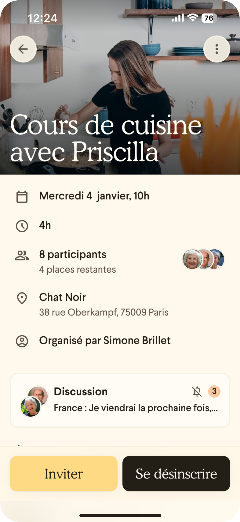
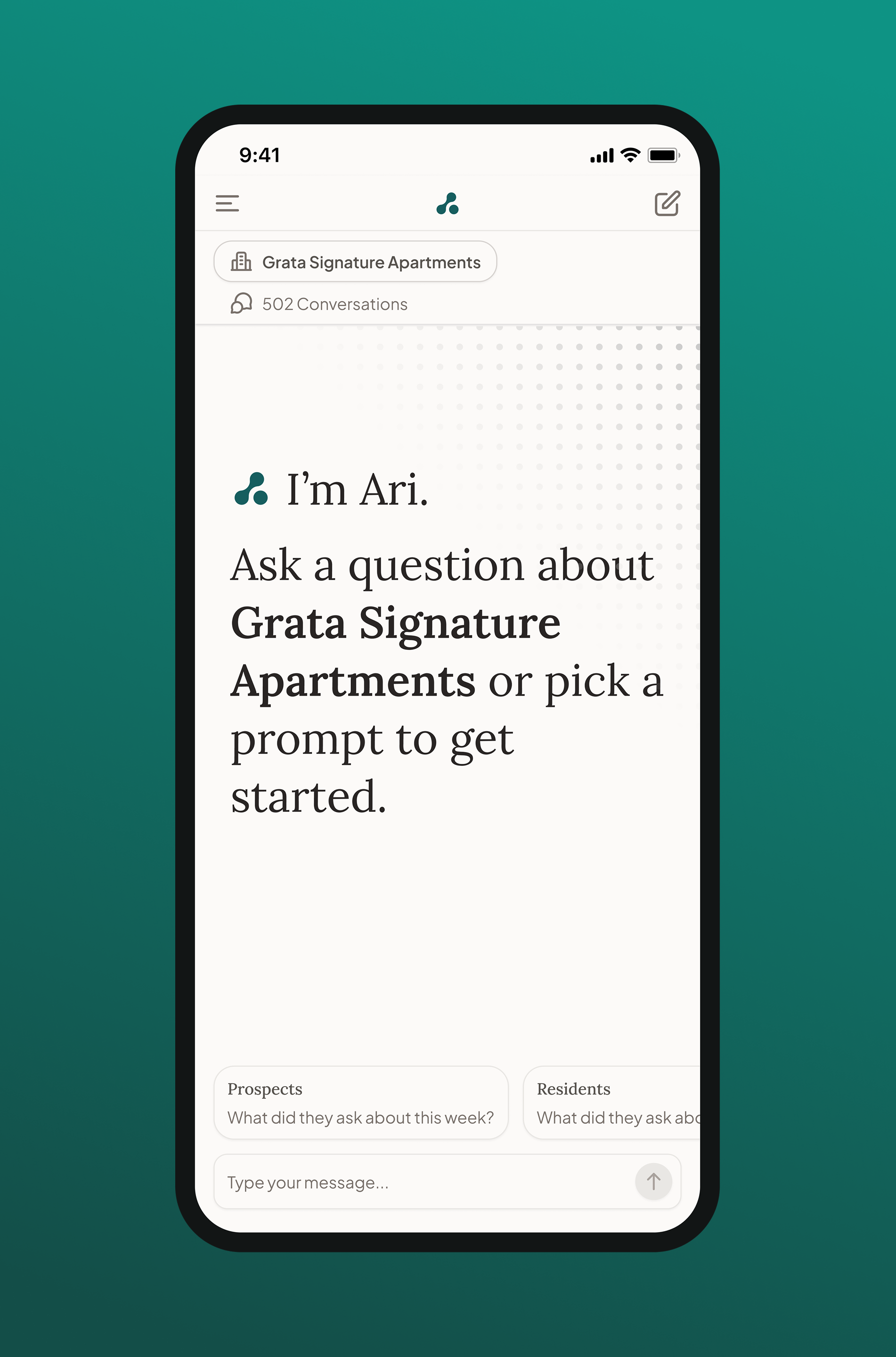
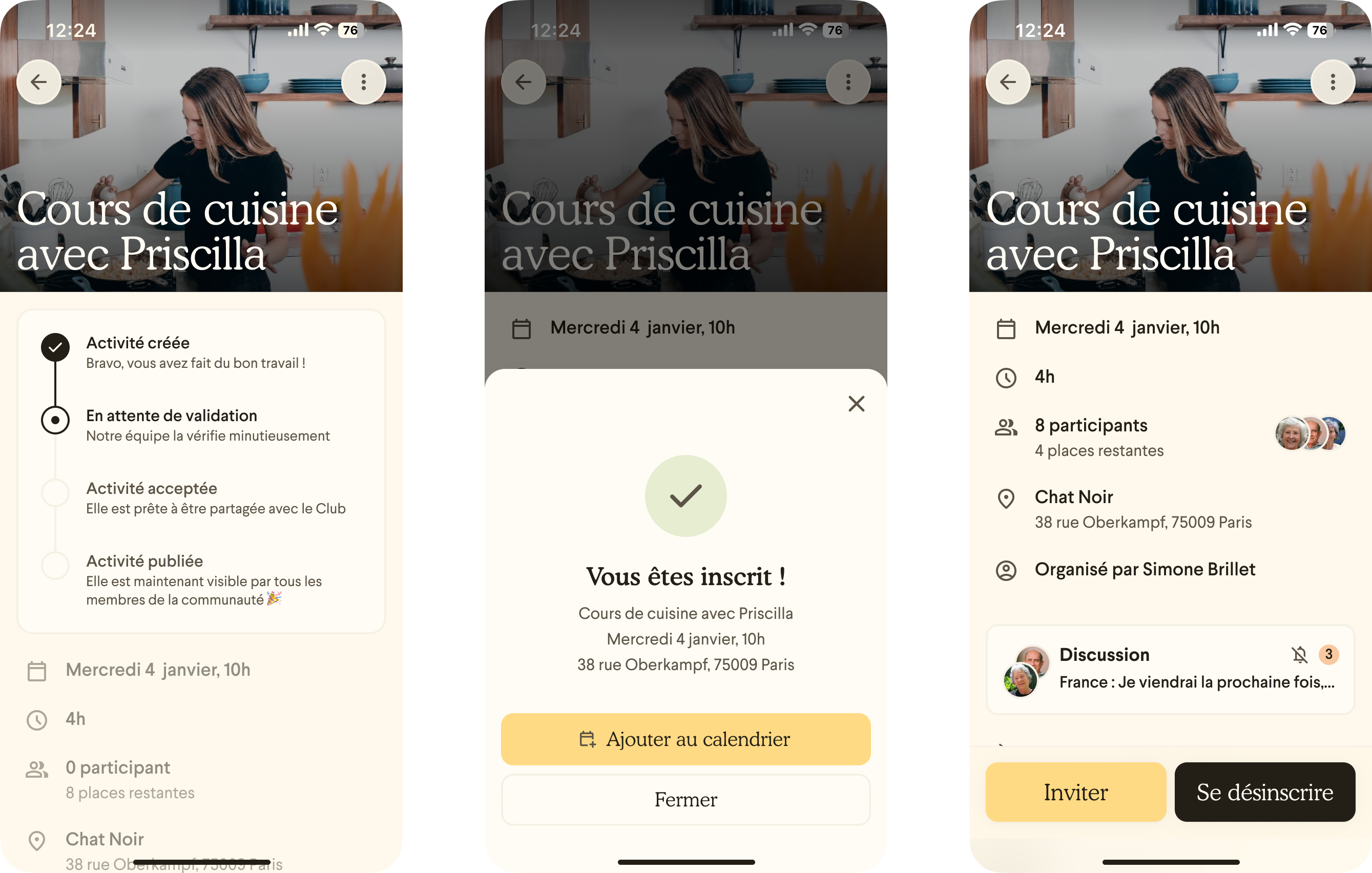
What Shipped
A messenger that earns the trust the product promises.
Widget messenger, final design
The compact state on a live property website. Resident photos and "Ask a real resident" establish human presence immediately. Expanded state: verified resident profiles with lifestyle detail, suggested prompts, and a subdued move-in bonus banner below the message area. The message field with a drafted message. Suggested prompts remain visible as alternatives or inspiration.
Identity verification
Profile detail (lifestyle, unit type, interests) increased perceived authenticity. Stock-looking photos undermined it.
Confirmation screen
The bonus drew attention but the "learn more" page overwhelmed users with conditions, turning a positive signal into a suspicious one.
Browser landing page, final design
Full-page layout for the standalone community landing page. Same interaction model as the widget, adapted for the broader canvas.
Neighbor Nurture email
The Neighbor Nurture email: a proactive, personalized outreach from a verified community resident. The highest-converting surface in the flow, now with cleaner layout, clearer bonus language, and explicit privacy disclosures.

Let’s chat

© 2026 Nina Haglund
NINA HAGLUND
About
Resume
Contact
Redesigning the Rentgrata Messenger around a new multi-resident routing system
Role
Lead Product Designer
Skills
Product Design, User Research, Testing
Shipped
Feb 2026
OVERVIEW
Rentgrata's core value is a real conversation with a real person. The UX wasn't living up to that promise.
Rentgrata helps prospective renters make better decisions by connecting them with verified current residents for authentic peer-to-peer conversations. The messenger widget that powered those conversations was outdated, confusing, and not converting. This project was a ground-up redesign, informed by 44 usability tests across three design variants, with the goal of making the product work as well as its premise.
WHAT IT WAS
A full redesign of the Rentgrata resident messenger, including the embeddable website widget, the standalone browser landing page, and the Neighbor Nurture email flow.
MY ROLE
Led research design, usability testing, synthesis, and all product design. Collaborated closely with product and engineering throughout.
The Approach
Three design variants tested with 44 users across multiple market segments before a single direction was finalized. Research drove the design, not the other way around.
The Strategic Change
Introduced a waterfall notification system that alerts multiple residents when a prospect sends a message, increasing the likelihood of a fast response.
Status
Shipped on multiple client websites in April 2026. Results are being tracked as the product ramps up across client communities.
THE PROBLEM
Three entry points. All of them needed work.
The Rentgrata messenger reached prospects through three entry points: a compact widget that lives on property management websites, a standalone browser landing page linked directly to a specific community, and a Neighbor Nurture email flow that proactively reaches prospects who have already shown interest. Each had its own design debt, but they shared the same underlying problems.
Getting to a testable direction required significant internal alignment first. Leadership, product, and design worked through many rounds of wireframes and structural explorations before the team agreed on what the redesign should actually solve for. That process was slow, but it was also valuable. By the time we reached high-fidelity designs, the entire team had a shared understanding of the problem and clear criteria for what success looked like. The 44-user usability study ran on those high-fidelity prototypes, which meant feedback was concrete and actionable rather than abstract.
The product's differentiator was authenticity, real residents, real answers. But the UX was eroding that trust before a prospect ever sent a message.
The existing designs were visually outdated and hadn't been revisited with fresh user research. The compact widget looked like a generic chat button, giving no signal that real people were on the other end. The "first available resident" routing logic confused users who expected to choose who they talked to. The move-in bonus, a genuine incentive, was being misread as a red flag. And nobody knew what happened after they hit send.
Underneath all of this was a more structural problem: resident response rates. When a prospect sent a message, it went to a single resident. If that resident was slow to respond or didn't respond at all, the conversation died. The team identified that alerting multiple residents through a waterfall system would dramatically improve response reliability. The design needed to support and communicate that change.
3
Messenger entry points redesigned: widget, browser page, and email

44 Users
Tested across 3 flow variants before final design was locked
72%
Resident response rate the waterfall system was designed to improve
Research
We tested three flows with 44 users. Here is what they told us.
Because this was a core conversion feature, we were intentional about not rushing to a solution. I designed three distinct high-fidelity flow variants and ran structured usability sessions across a broad range of user types. Testing at high fidelity was a deliberate choice: users respond differently to polished designs than to wireframes, and because this was a trust-sensitive feature, we needed to understand reactions to the actual visual language, not just the structure. The goal was to stress-test our assumptions about what users understood and what they trusted.
The sessions surfaced five consistent themes that shaped every significant design decision in the final product.
1.
Users assumed the widget was a bot, not a real person.
The AI saturation problem in tech was directly undermining Rentgrata's core differentiator. "When on a site like this, I don't think it's a real person." Profile photos helped, but only when they looked genuinely personal rather than professional or stock. Verified checkmarks, paradoxically, made some users more skeptical — the association with Twitter had devalued the signal.
2.
"First available resident" phrasing created confusion and reduced trust.
Users wanted to choose who they talked to. The first-available routing logic felt impersonal and raised questions about whether residents were real, incentivized to say positive things, or even available. "I don't like that because I want to have a selection to choose from." The design needed to communicate the process clearly without making it feel like a lottery.
3.
The move-in bonus was noticed but poorly understood.
The bonus drew attention. It was often the first thing users noticed. But the "learn more" page overwhelmed them with conditions and made the offer feel suspicious. "I don't trust the bonus offer, it feels too good to be true." Placement also mattered: positioned near resident profiles, it made users wonder if residents were being paid to say positive things.
4.
Nobody knew what happened after they hit send.
Users had no mental model for what the confirmation screen meant. How would the response come? When? Via what channel? "How am I going to be communicating with them? If they respond to me, how do I know?" The research was emphatic: SMS delivery and a response time estimate were not nice-to-haves. They were necessary for the experience to feel complete.
5.
Design A won on trust. Design C won on speed. The recommendation was Design C with Design A's trust language.
Design A (resident-first, intentional setup before messaging) felt more authentic. Design C (message-first, prompts visible immediately) felt faster and more intuitive. The final recommendation adopted Design C as the foundation and incorporated the trust-building elements, verified badges, resident lifestyle details, and clearer process language, that made Design A feel credible.
Research Synthesis
Theme synthesis from the compact widget testing sessions. The dominant finding: AI prevalence in consumer tech had primed users to assume they were talking to a bot. Real photos helped, but nothing fully solved the trust problem at the compact state.
theme: Resident authenticity
Profile detail (lifestyle, unit type, interests) increased perceived authenticity. Stock-looking photos undermined it.
Theme: Move-in bonus
The bonus drew attention but the "learn more" page overwhelmed users with conditions, turning a positive signal into a suspicious one.
theme: Confirmation screen
Design A won on trust. Design C won on speed and simplicity. The final recommendation synthesized both.
Flow preference testing
Users consistently wanted to know: how will I hear back, via what channel, and when? SMS and a response time estimate were non-negotiable.
Design Decisions
Every major call came directly from what users told us.
Most of the interesting decisions in this project weren't about pixels. They were about what kind of product to build, who to build it for, and what to leave on the table.
Trust
Lead with real people, not a generic chat prompt.
The compact widget now surfaces resident photos and names immediately, with "Ask a real resident" as the primary label. The goal was to establish human presence before the user even clicked. The expanded state shows verified resident profiles with lifestyle context, unit size, whether they have a dog, whether they work remote, the kind of detail that reads as genuinely personal rather than managed.
Routing Clarity
Replace "first available resident" with clearer multi-message language.
Rather than trying to explain the routing algorithm, the confirmation screen communicates the outcome: "We sent your message to a few residents for the quickest response." That framing is accurate, user-friendly, and resolves the confusion about who receives the message without requiring the user to understand the underlying system.
Conversion
Move the bonus down. Make it quieter.
The move-in bonus was repositioned to a subdued banner below the main message area, reducing its visual competition with the primary CTA. The language was simplified and the "learn more" destination was updated to be cleaner and less overwhelming. The bonus stays visible, it is a genuine incentive, but it no longer dominates the screen or raise red flags by proximity to resident profiles.
Post-send clarity
The confirmation screen now answers all three questions users asked.
How will I hear back? Via SMS, texted to your phone. When? Most residents reply within 24 hours. What happens if they don't respond? The waterfall system means multiple residents were alerted, so one person's inactivity doesn't kill the conversation. All three answers are visible on the confirmation screen without the user having to ask.
Neighbor Nurture
The email needed to feel like it came from a person, not a system.
The Neighbor Nurture email is the highest-converting entry point in the entire flow because it arrives as a warm, proactive invitation from a specific community member rather than a generic prompt. The redesign preserved that warmth while cleaning up the layout, clarifying the move-in bonus language, and adding explicit privacy language that explained how contact information would be handled.
The waterfall system: The most significant product change in this redesign wasn't visual. It was structural. When a prospect sends a message, it is now routed to multiple residents in sequence rather than a single person. If the first resident doesn't respond within a set window, the message goes to the next. The design had to communicate this system honestly without making it feel impersonal, which is why the language focuses on the outcome ("quickest response") rather than the mechanism.
What Shipped
A messenger that earns the trust the product promises.
Widget messenger, final design
The compact state on a live property website. Resident photos and "Ask a real resident" establish human presence immediately. Expanded state: verified resident profiles with lifestyle detail, suggested prompts, and a subdued move-in bonus banner below the message area. The message field with a drafted message. Suggested prompts remain visible as alternatives or inspiration.
Identity verification
Profile detail (lifestyle, unit type, interests) increased perceived authenticity. Stock-looking photos undermined it.
Confirmation screen
The bonus drew attention but the "learn more" page overwhelmed users with conditions, turning a positive signal into a suspicious one.
Browser landing page, final design
Full-page layout for the standalone community landing page. Same interaction model as the widget, adapted for the broader canvas.
Neighbor Nurture email
The Neighbor Nurture email: a proactive, personalized outreach from a verified community resident. The highest-converting surface in the flow, now with cleaner layout, clearer bonus language, and explicit privacy disclosures.
Let’s chat
© 2026 Nina Haglund
NINA HAGLUND
About
Resume
Contact
Redesigning the Rentgrata Messenger around a new multi-resident routing system
Role
Lead Product Designer
Skills
Product Design, User Research, Testing
Shipped
Feb 2026
OVERVIEW
Rentgrata's core value is a real conversation with a real person. The UX wasn't living up to that promise.
Rentgrata helps prospective renters make better decisions by connecting them with verified current residents for authentic peer-to-peer conversations. The messenger widget that powered those conversations was outdated, confusing, and not converting. This project was a ground-up redesign, informed by 44 usability tests across three design variants, with the goal of making the product work as well as its premise.
WHAT IT WAS
A full redesign of the Rentgrata resident messenger, including the embeddable website widget, the standalone browser landing page, and the Neighbor Nurture email flow.
MY ROLE
Led research design, usability testing, synthesis, and all product design. Collaborated closely with product and engineering throughout.
The Approach
Three design variants tested with 44 users across multiple market segments before a single direction was finalized. Research drove the design, not the other way around.
The Strategic Change
Introduced a waterfall notification system that alerts multiple residents when a prospect sends a message, increasing the likelihood of a fast response.
Status
Shipped on multiple client websites in April 2026. Results are being tracked as the product ramps up across client communities.
THE PROBLEM
Three entry points. All of them needed work.
The Rentgrata messenger reached prospects through three entry points: a compact widget that lives on property management websites, a standalone browser landing page linked directly to a specific community, and a Neighbor Nurture email flow that proactively reaches prospects who have already shown interest. Each had its own design debt, but they shared the same underlying problems.
Getting to a testable direction required significant internal alignment first. Leadership, product, and design worked through many rounds of wireframes and structural explorations before the team agreed on what the redesign should actually solve for. That process was slow, but it was also valuable. By the time we reached high-fidelity designs, the entire team had a shared understanding of the problem and clear criteria for what success looked like. The 44-user usability study ran on those high-fidelity prototypes, which meant feedback was concrete and actionable rather than abstract.
The product's differentiator was authenticity, real residents, real answers. But the UX was eroding that trust before a prospect ever sent a message.
The existing designs were visually outdated and hadn't been revisited with fresh user research. The compact widget looked like a generic chat button, giving no signal that real people were on the other end. The "first available resident" routing logic confused users who expected to choose who they talked to. The move-in bonus, a genuine incentive, was being misread as a red flag. And nobody knew what happened after they hit send.
Underneath all of this was a more structural problem: resident response rates. When a prospect sent a message, it went to a single resident. If that resident was slow to respond or didn't respond at all, the conversation died. The team identified that alerting multiple residents through a waterfall system would dramatically improve response reliability. The design needed to support and communicate that change.
3
Messenger entry points redesigned: widget, browser page, and email
44 Users
Tested across 3 flow variants before final design was locked
72%
Resident response rate the waterfall system was designed to improve
Research
We tested three flows with 44 users. Here is what they told us.
Because this was a core conversion feature, we were intentional about not rushing to a solution. I designed three distinct high-fidelity flow variants and ran structured usability sessions across a broad range of user types. Testing at high fidelity was a deliberate choice: users respond differently to polished designs than to wireframes, and because this was a trust-sensitive feature, we needed to understand reactions to the actual visual language, not just the structure. The goal was to stress-test our assumptions about what users understood and what they trusted.
The sessions surfaced five consistent themes that shaped every significant design decision in the final product.
1.
Users assumed the widget was a bot, not a real person.
The AI saturation problem in tech was directly undermining Rentgrata's core differentiator. "When on a site like this, I don't think it's a real person." Profile photos helped, but only when they looked genuinely personal rather than professional or stock. Verified checkmarks, paradoxically, made some users more skeptical — the association with Twitter had devalued the signal.
2.
"First available resident" phrasing created confusion and reduced trust.
Users wanted to choose who they talked to. The first-available routing logic felt impersonal and raised questions about whether residents were real, incentivized to say positive things, or even available. "I don't like that because I want to have a selection to choose from." The design needed to communicate the process clearly without making it feel like a lottery.
3.
The move-in bonus was noticed but poorly understood.
The bonus drew attention. It was often the first thing users noticed. But the "learn more" page overwhelmed them with conditions and made the offer feel suspicious. "I don't trust the bonus offer, it feels too good to be true." Placement also mattered: positioned near resident profiles, it made users wonder if residents were being paid to say positive things.
4.
Nobody knew what happened after they hit send.
Users had no mental model for what the confirmation screen meant. How would the response come? When? Via what channel? "How am I going to be communicating with them? If they respond to me, how do I know?" The research was emphatic: SMS delivery and a response time estimate were not nice-to-haves. They were necessary for the experience to feel complete.
5.
Design A won on trust. Design C won on speed. The recommendation was Design C with Design A's trust language.
Design A (resident-first, intentional setup before messaging) felt more authentic. Design C (message-first, prompts visible immediately) felt faster and more intuitive. The final recommendation adopted Design C as the foundation and incorporated the trust-building elements, verified badges, resident lifestyle details, and clearer process language, that made Design A feel credible.
Research Synthesis
Theme synthesis from the compact widget testing sessions. The dominant finding: AI prevalence in consumer tech had primed users to assume they were talking to a bot. Real photos helped, but nothing fully solved the trust problem at the compact state.
theme: Resident authenticity
Profile detail (lifestyle, unit type, interests) increased perceived authenticity. Stock-looking photos undermined it.
Theme: Move-in bonus
The bonus drew attention but the "learn more" page overwhelmed users with conditions, turning a positive signal into a suspicious one.
theme: Confirmation screen
Design A won on trust. Design C won on speed and simplicity. The final recommendation synthesized both.
Flow preference testing
Users consistently wanted to know: how will I hear back, via what channel, and when? SMS and a response time estimate were non-negotiable.
Design Decisions
Every major call came directly from what users told us.
Most of the interesting decisions in this project weren't about pixels. They were about what kind of product to build, who to build it for, and what to leave on the table.
Trust
Lead with real people, not a generic chat prompt.
The compact widget now surfaces resident photos and names immediately, with "Ask a real resident" as the primary label. The goal was to establish human presence before the user even clicked. The expanded state shows verified resident profiles with lifestyle context, unit size, whether they have a dog, whether they work remote, the kind of detail that reads as genuinely personal rather than managed.
Routing Clarity
Replace "first available resident" with clearer multi-message language.
Rather than trying to explain the routing algorithm, the confirmation screen communicates the outcome: "We sent your message to a few residents for the quickest response." That framing is accurate, user-friendly, and resolves the confusion about who receives the message without requiring the user to understand the underlying system.
Conversion
Move the bonus down. Make it quieter.
The move-in bonus was repositioned to a subdued banner below the main message area, reducing its visual competition with the primary CTA. The language was simplified and the "learn more" destination was updated to be cleaner and less overwhelming. The bonus stays visible, it is a genuine incentive, but it no longer dominates the screen or raise red flags by proximity to resident profiles.
Post-send clarity
The confirmation screen now answers all three questions users asked.
How will I hear back? Via SMS, texted to your phone. When? Most residents reply within 24 hours. What happens if they don't respond? The waterfall system means multiple residents were alerted, so one person's inactivity doesn't kill the conversation. All three answers are visible on the confirmation screen without the user having to ask.
Neighbor Nurture
The email needed to feel like it came from a person, not a system.
The Neighbor Nurture email is the highest-converting entry point in the entire flow because it arrives as a warm, proactive invitation from a specific community member rather than a generic prompt. The redesign preserved that warmth while cleaning up the layout, clarifying the move-in bonus language, and adding explicit privacy language that explained how contact information would be handled.
The waterfall system: The most significant product change in this redesign wasn't visual. It was structural. When a prospect sends a message, it is now routed to multiple residents in sequence rather than a single person. If the first resident doesn't respond within a set window, the message goes to the next. The design had to communicate this system honestly without making it feel impersonal, which is why the language focuses on the outcome ("quickest response") rather than the mechanism.
What Shipped
A messenger that earns the trust the product promises.
Widget messenger, final design
The compact state on a live property website. Resident photos and "Ask a real resident" establish human presence immediately. Expanded state: verified resident profiles with lifestyle detail, suggested prompts, and a subdued move-in bonus banner below the message area. The message field with a drafted message. Suggested prompts remain visible as alternatives or inspiration.
Identity verification
Profile detail (lifestyle, unit type, interests) increased perceived authenticity. Stock-looking photos undermined it.
Confirmation screen
The bonus drew attention but the "learn more" page overwhelmed users with conditions, turning a positive signal into a suspicious one.
Browser landing page, final design
Full-page layout for the standalone community landing page. Same interaction model as the widget, adapted for the broader canvas.
Neighbor Nurture email
The Neighbor Nurture email: a proactive, personalized outreach from a verified community resident. The highest-converting surface in the flow, now with cleaner layout, clearer bonus language, and explicit privacy disclosures.
Let’s chat
© 2026 Nina Haglund